Terms and Conditions

The information posted on the Sound Healers Association website  is not intended to treat or cure any disease, nor should any of the subject matter presented on this website be taken as medical advice. There are no medical claims for any of these products or information as they are for entertainment only. Please consult your doctor if you have a medical condition or any questions or concerns about using any type of aids like these. The products on this website have not been evaluated by the Food and Drug Administration (FDA).

Terms & Conditions

1. Membership Terms

2. Security & Privacy

3. Privacy Policy

4. Conditions of Use


1. Membership Terms

The Sound Healers Association  directory is a public document. The posting of any and all contact information and personal details are optional, but all data that members choose to post will be in the public domain. The Sound Healers Association is not responsible for the nature of any communication that may result from the choice to post in the Sound Healers Association directory. The Sound Healers Association is to be held free of all liability from any and all consequences that may result from contacts and communications that originate due to participation in the Sound Healers Association Directory.

The standard registration for the Sound Healers Association requires the submission of a $35 fee. The premium registration for the Sound Healers Association requires the submission of a $65 fee.Continued membership in the Sound Healers Association is billed at an annual rate based on level of membership per year. Membership may be cancelled at anytime. In the event of cancellation, all recurring billing will cease, but the pro rated balance from any previous payment is non-refundable.

The general Sound Healers Association directory is an open networking directory and communication resource. It is currently open to all practitioners of Sound Healing, Energy Medicine, Body Work, Vibrational Healing, Musicians and related modalities. Members are not submitted to any specific application process or assessment of credentials. A listing in the Sound Healers Association directory does not imply any sort of accreditiation, certification, or endorsement by the Sound Healers Association.

2. Security and Privacy

We know you’re concerned about online security and privacy. We hope this will answer all of your questions.

  • Our secure server: Our Secure Sockets Layer (SSL) software is the industry standard and among the best software available today for secure commerce transactions. It encrypts all of your personal information, including credit card number, name, and address, so that it cannot be read as the information travels over the Internet. You can safely enter your entire credit card number on the secure server and it cannot be read in transit. Remember, if you choose the secure server, all the information you enter on the order form—name, address, phone number, etc.—is safely encrypted.
  • How we store your credit card number: To give you an additional layer of security, we never store your credit card information. After you type in your credit card number, fax it in, or call it in, your complete credit card number is transferred securely to our payment processing network. Again, your information is never stored and so cannot be stolen, pirated or distributed.
  • We respect your personal privacy: We do not sell or rent our list of customers to anyone. Period.

3. Privacy Policy

Sound Healers Association knows you care how information about you is used and shared, and we appreciate your trust that we will do so carefully and sensibly. This notice describes our privacy policy. By visiting Sound Healers Association, you are accepting the practices described in this Privacy Notice.

What Personal Information About Customers Does Sound Healers Association Gather? The information we learn from members helps us personalize and continually improve your experience at Sound Healers Association Here are the types of information we gather.

Information You Give Us: We receive and store any information you enter on our Web site or give us in any other way. You can choose not to provide certain information, but then you might not be able to take advantage of many of our features. We use the information that you provide for such purposes as responding to your requests, customizing future shopping for you, improving our stores, and communicating with you.

Automatic Information: We receive and store certain types of information whenever you interact with us. For example, like many Web sites, we use “cookies,” and we obtain certain types of information when your Web browser accesses Sound Healers Association. Scroll to the bottom of this page to see examples of the information we receive. A number of companies offer utilities designed to help you visit Web sites anonymously. Although we will not be able to provide you with a personalized experience at Sound Healers Association if we cannot recognize you, we want you to be aware that these tools exist.

What About Cookies? Cookies are alphanumeric identifiers that we transfer to your computer’s hard drive through your Web browser to enable our systems to recognize your browser and to provide features such as automatic login and permanent shopping carts for storage of items in your Shopping Cart between visits.

The “help” portion of the toolbar on most browsers will tell you how to prevent your browser from accepting new cookies, how to have the browser notify you when you receive a new cookie, or how to disable cookies altogether. However, cookies allow you to take full advantage of some of Sound Healers Association coolest features, and we recommend that you leave them turned on.

Does Sound Healers Association Share the Information It Receives? Information about our customers is an important part of our business, and we are not in the business of selling it to others. We share customer information only with the subsidiaries Sound Healers Association controls and as described below.

Affiliated Businesses We Do Not Control: We work closely with our affiliated businesses. In some cases, these businesses operate stores at Sound Healers Association or sell offerings to you at Sound Healers Association. In other cases, we operate stores, provide services, or sell product lines jointly with these businesses. You can tell when another business is involved in your transactions, and we share customer information related to those transactions with that business.

Agents: If we employ other companies and individuals to perform functions on our behalf, examples of such activities may include include fulfilling orders, delivering packages, sending postal mail and e-mail, removing repetitive information from customer lists, analyzing data, providing marketing assistance, processing credit card payments, and providing customer service. They may have access to personal information limited to only what may be necessary to perform their functions, but may not use it for other purposes.

Promotional Offers: Sometimes we send offers to selected groups of Sound Healers Association customers on behalf of other businesses. When we do this, we do not give that business your name and address. If you do not want to receive such offers, please adjust your account newsletter preference as that is how we will send out our promotions.

Business Transfers: As we continue to develop our business, we might sell or buy stores or assets. In such transactions, customer information generally is one of the transferred business assets. Also, in the unlikely event that Sound Healers Association or substantially all of its assets are acquired, customer information will of course be one of the transferred assets.

Protection of Sound Healers Association and Others: We release account and other personal information when we believe release is appropriate to comply with law; enforce or apply our Conditions of Use and other agreements; or protect the rights, property, or safety of Sound Healers Association our users, or others. This includes exchanging information with other companies and organizations for fraud protection and credit risk reduction.

With Your Consent: Other than as set out above, you will receive notice when information about you might go to third parties, and you will have an opportunity to choose not to share the information.

How Secure Is Information About Me? We work to protect the security of your information during transmission by using Authorize.net to facilitate our credit card transactions. Authorize.net processes the credit cards, so Sound Healers Association will NEVER see you credit card number. Authorize.net protects your privacy and information by using Secure Sockets Layer (SSL) software, which encrypts information you input.

It is important for you to protect against unauthorized access to your password and to your computer. Be sure to sign off when finished using a shared computer.

What Information Can I Access? Sound Healers Association gives you access to the following information about you for the limited purpose of viewing and, in certain cases, updating that information. This list will change as our Web site evolves.

What Choices Do I Have? As discussed above, you can always choose not to provide information, even though it might be needed to make a purchase or to take advantage of such Sound Healers Association features as Automatic login, and permanent shopping carts. You can add or update certain information on pages such as those listed in the “My Account” pages. When you update information, we usually keep a copy of the prior version for our records. If you do not want to receive e-mail or other mail from us, please adjust your account to reflect this in the newsletter menu.

Children?  Sound Healers Association does not sell products for purchase by children. If you are under 18, you may use Sound Healers Association only with involvement of a parent or guardian.

Conditions of Use, Notices, and Revisions If you choose to visit Sound Healers Association, your visit and any dispute over privacy is subject to this Notice and our Conditions of Use, including limitations on damages, arbitration of disputes, and application of the law of the state of Colorado. If you have any concern about privacy at Sound Healers Association, please send us a thorough description to  , and we will try to resolve it. Our business changes constantly. This Notice and the Conditions of Use will change also, and use of information that we gather now is subject to the Privacy Notice in effect at the time of use. We may e-mail periodic reminders of our notices and conditions, unless you have instructed us not to, but you should check our Web site frequently to see recent changes.

Information You Give Us You provide most such information when you search, buy, bid, post, participate in a contest or questionnaire, or communicate with customer service. For example, you provide information when you search for a product; make an order or an Auction bid; provide information in Your Account (and you might have more than one if you have used more than one e-mail address when shopping with us); communicate with us by phone, e-mail, or otherwise; complete a questionnaire or a contest entry form; by providing employer, school, or other such information; participate in Discussion Boards; provide and rate Reviews. As a result of those actions, you might supply us with such information as your name, address, and phone number; people to whom purchases have been shipped, including address and phone number; other people; content of reviews and e-mails to us; and financial information, including Social Security and driver’s license numbers.

Automatic Information Examples of the information we collect and analyze include the Internet protocol (IP) address used to connect your computer to the Internet; login; e-mail address; password; computer and connection information such as browser type and version, operating system, and platform; purchase history; the full Uniform Resource Locators (URL) clickstream to, through, and from our Web site, including date and time; cookie number; and products you viewed or searched for.

4. Conditions of Use

Welcome to Sound Healers Association.org

Sound Healers Association and its affiliates provide their services to you subject to the following conditions. If you visit or shop at the Sound Healers Association, you accept these conditions. Please read them carefully. In addition, when you use any current or future Sound Healers Association service or visit or purchase from any business affiliated with Sound Healers Association, whether or not included in the Sound Healers Association Web site, you also will be subject to the guidelines and conditions applicable to such service or business.

PRIVACY Please review our Privacy Notice, which also governs your visit to Sound Healers Association, to understand our practices.

ELECTRONIC COMMUNICATIONS When you visit Sound Healers Association or send e-mails to us, you are communicating with us electronically. You consent to receive communications from us electronically. We will communicate with you by e-mail or by posting notices on this site. You agree that all agreements, notices, disclosures and other communications that we provide to you electronically satisfy any legal requirement that such communications be in writing.

COPYRIGHT All content included on this site, such as text, graphics, logos, button icons, images, audio clips, digital downloads, data compilations, and software, is the property of Sound Healers Association or its content suppliers and protected by United States and international copyright laws. The compilation of all content on this site is the exclusive property of Sound Healers Association and protected by U.S. and international copyright laws. All software used on this site is the property of Sound Healers Association or its software suppliers and protected by United States and international copyright laws.

LICENSE AND SITE ACCESS Sound Healers Association grants you a limited license to access and make personal use of this site and not to download (other than page caching) or modify it, or any portion of it, except with express written consent of Sound Healers Association. This license does not include any resale or commercial use of this site or its contents; any collection and use of any product listings, descriptions, or prices; any derivative use of this site or its contents; any downloading or copying of account information for the benefit of another merchant; or any use of data mining, robots, or similar data gathering and extraction tools. This site or any portion of this site may not be reproduced, duplicated, copied, sold, resold, visited, or otherwise exploited for any commercial purpose without express written consent of Sound Healers Association. You may not frame or utilize framing techniques to enclose any trademark, logo, or other proprietary information (including images, text, page layout, or form) of Sound Healers Association and our affiliates without express written consent. You may not use any meta tags or any other “hidden text” utilizing Sound Healers Association‘ name or trademarks without the express written consent of Sound Healers Association. Any unauthorized use terminates the permission or license granted by Sound Healers Association. You are granted a limited, revocable, and nonexclusive right to create a hyperlink to the home page of Sound Healers Association so long as the link does not portray Sound Healers Association, its affiliates, or their products or services in a false, misleading, derogatory, or otherwise offensive matter. You may not use any Sound Healers Association. logo or other proprietary graphic or trademark as part of the link without express written permission.

YOUR ACCOUNT If you use this site, you are responsible for maintaining the confidentiality of your account and password and for restricting access to your computer, and you agree to accept responsibility for all activities that occur under your account or password. Sound Healers Association does sell products for children, but it sells them to adults, who can purchase with a credit card. If you are under 18, you may use Sound Healers Association. only with involvement of a parent or guardian. Sound Healers Association and its affiliates reserve the right to refuse service, terminate accounts, remove or edit content, or cancel orders in their sole discretion.

REVIEWS, COMMENTS, COMMUNICATIONS, AND OTHER CONTENT Visitors may post reviews, comments, and other content; and submit suggestions, ideas, comments, questions, or other information, so long as the content is not illegal, obscene, threatening, defamatory, invasive of privacy, infringing of intellectual property rights, or otherwise injurious to third parties or objectionable and does not consist of or contain software viruses, political campaigning, commercial solicitation. You may not use a false e-mail address, impersonate any person or entity, or otherwise mislead as to the origin of content. Sound Healers Association reserves the right (but not the obligation) to remove or edit such content, but does not regularly review posted content. If you do post content or submit material, and unless we indicate otherwise, you grant Sound Healers Association and its affiliates a nonexclusive, royalty-free, perpetual, irrevocable, and fully sublicensable right to use, reproduce, modify, adapt, publish, translate, create derivative works from, distribute, and display such content throughout the world in any media. You grant Sound Healers Association and its affiliates and sublicensees the right to use the name that you submit in connection with such content, if they choose. You represent and warrant that you own or otherwise control all of the rights to the content that you post; that the content is accurate; that use of the content you supply does not violate this policy and will not cause injury to any person or entity; and that you will indemnify Sound Healers Association or its affiliates for all claims resulting from content you supply. Sound Healers Association has the right but not the obligation to monitor and edit or remove any activity or content. Sound Healers Association takes no responsibility and assumes no liability for any content posted by you or any third party.

COPYRIGHT COMPLAINTS Sound Healers Association and its affiliates respect the intellectual property of others. If you believe that your work has been copied in a way that constitutes copyright infringement, email us with your complaint.

RISK OF LOSS All items purchased from Sound Healers Association are made pursuant to a shipment contract. This means that the risk of loss and title for such items pass to you upon our delivery to the carrier.

PRODUCT DESCRIPTIONS Sound Healers Association. and its affiliates attempt to be as accurate as possible. However, Sound Healers Association does not warrant that product descriptions or other content of this site is accurate, complete, reliable, current, or error-free. If a product offered by Sound Healers Association itself is not as described, your sole remedy is to return it in unused condition.

OTHER BUSINESSES Parties other than Sound Healers Association and its subsidiaries operate stores, provide services, or sell product lines on this site. In addition, we provide links to the sites of affiliated companies and certain other businesses. We are not responsible for examining or evaluating, and we do not warrant the offerings of, any of these businesses or individuals or the content of their Web sites. Sound Healers Association does not assume any responsibility or liability for the actions, product, and content of all these and any other third parties. You should carefully review their privacy statements and other conditions of use.

DISCLAIMER OF WARRANTIES AND LIMITATION OF LIABILITY THIS SITE IS PROVIDED BY Sound Healers Association ON AN “AS IS” AND “AS AVAILABLE” BASIS. Sound Healers Association MAKES NO REPRESENTATIONS OR WARRANTIES OF ANY KIND, EXPRESS OR IMPLIED, AS TO THE OPERATION OF THIS SITE OR THE INFORMATION, CONTENT, MATERIALS, OR PRODUCTS INCLUDED ON THIS SITE. YOU EXPRESSLY AGREE THAT YOUR USE OF THIS SITE IS AT YOUR SOLE RISK. TO THE FULL EXTENT PERMISSIBLE BY APPLICABLE LAW, Sound Healers Association DISCLAIMS ALL WARRANTIES, EXPRESS OR IMPLIED, INCLUDING, BUT NOT LIMITED TO, IMPLIED WARRANTIES OF MERCHANTABILITY AND FITNESS FOR A PARTICULAR PURPOSE. Sound Healers Association DOES NOT WARRANT THAT THIS SITE, ITS SERVERS, OR E-MAIL SENT FROM Sound Healers Association ARE FREE OF VIRUSES OR OTHER HARMFUL COMPONENTS. Sound Healers Association WILL NOT BE LIABLE FOR ANY DAMAGES OF ANY KIND ARISING FROM THE USE OF THIS SITE, INCLUDING, BUT NOT LIMITED TO DIRECT, INDIRECT, INCIDENTAL, PUNITIVE, AND CONSEQUENTIAL DAMAGES. CERTAIN STATE LAWS DO NOT ALLOW LIMITATIONS ON IMPLIED WARRANTIES OR THE EXCLUSION OR LIMITATION OF CERTAIN DAMAGES. IF THESE LAWS APPLY TO YOU, SOME OR ALL OF THE ABOVE DISCLAIMERS, EXCLUSIONS, OR LIMITATIONS MAY NOT APPLY TO YOU, AND YOU MIGHT HAVE ADDITIONAL RIGHTS.

APPLICABLE LAW By visiting Sound Healers Association, you agree that the laws of the state of Colorado, without regard to principles of conflict of laws, will govern these Conditions of Use and any dispute of any sort that might arise between you and Sound Healers Association or its affiliates.

DISPUTES Any dispute relating in any way to your visit to Sound Healers Association or to products you purchase through Sound Healers Association shall be submitted to confidential arbitration in Boulder, Colorado, except that, to the extent you have in any manner violated or threatened to violate Sound Healers Association‘ intellectual property rights, Sound Healers Association may seek injunctive or other appropriate relief in any state or federal court in the state of Colorado, and you consent to exclusive jurisdiction and venue in such courts. Arbitration under this agreement shall be conducted under the rules then prevailing of the American Arbitration Association. The arbitrator’s award shall be binding and may be entered as a judgment in any court of competent jurisdiction. To the fullest extent permitted by applicable law, no arbitration under this Agreement shall be joined to an arbitration involving any other party subject to this Agreement, whether through class arbitration proceedings or otherwise.

SITE POLICIES, MODIFICATION, AND SEVERABILITY Please review our other policies, posted on this site. These policies also govern your visit to Sound Healers Association. We reserve the right to make changes to our site, policies, and these Conditions of Use at any time. If any of these conditions shall be deemed invalid, void, or for any reason unenforceable, that condition shall be deemed severable and shall not affect the validity and enforceability of any remaining condition.

Menu Options

RokNavMenu is the core of all the powerful Paradigm menu system. Please ensure you are using the latest version of RokNavMenu, available here.


Dropdown Menu

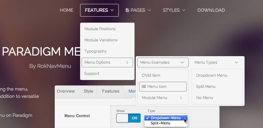
The Dropdown Menu is an advanced CSS drive dropdown menu system. It offers advanced structural features such as multiple columns, inline icons and text, inline modules and positions, custom column widths, item distribution and menu offset. All of these are configurable for each menu item.

Dropdown Menu
 

SplitMenu

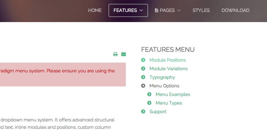
A static menu system that displays 1st level items in the main horizontal menu and further children in the Sidebar.

SplitMenu
 

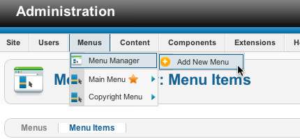
All Menu Items can be edited from Admin → Menu → Menu NameMenu Item.


image

Responsive Mode: Smartphone

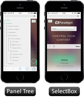
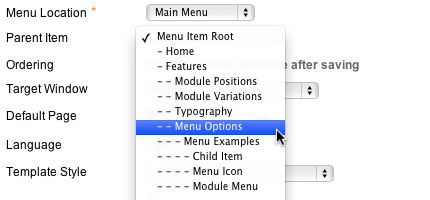
For mobile devices, there are two options, a dropdown panel menu with items in a tree format or a select box using the browsers own UI elements. Chose a format in the template's menu settings.

The mobile menu is active for both the Dropdown Menu and SplitMenu.


Creating child menu items

Go to Admin → Menu → A MenuA Menu Item → Select a Parent Item, and it will appear as a child of it.

image
image

Template Typography

Headings

All HTML headings, <h1> through <h6> are available.

h1. Heading 1

h2. Heading 2

h3. Heading 3

h4. Heading 4

h5. Heading 5
h6. Heading 6

Built with Less

The typographic scale is based on two LESS variables in variables.less: @baseFontSize and @baseLineHeight. The first is the base font-size used throughout and the second is the base line-height. We use those variables and some simple math to create the margins, paddings, and line-heights of all our type and more. Customize them and Bootstrap adapts.

Body copy

Bootstrap's global default font-size is 14px, with a line-height of 1.7em. This is applied to the <body> and all paragraphs. In addition, <p> (paragraphs) receive a bottom margin of half their line-height (9px by default).

Nullam quis risus eget urna mollis ornare vel eu leo. Cum sociis natoque penatibus et magnis dis parturient montes, nascetur ridiculus mus. Nullam id dolor id nibh ultricies vehicula.

<p>...</p>

Lead body copy

Make a paragraph stand out by adding .lead.

Vivamus sagittis lacus vel augue laoreet rutrum faucibus dolor auctor. Duis mollis, est non commodo luctus.

<p class="lead">...</p>

Emphasis

Make use of HTML's default emphasis tags with lightweight styles.

<em>

For emphasizing a snippet of text with stress

The following snippet of text is rendered as italicized text.

<em>rendered as italicized text</em>

<strong>

For emphasizing a snippet of text with important

The following snippet of text is rendered as bold text.

<strong>rendered as bold text</strong>

<small>

For de-emphasizing inline or blocks of text, use the small tag.

This line of text is meant to be treated as fine print.

<p>
  <small>This line of text is meant to be treated as fine print.</small>
</p>

Note: Feel free to use <b> and <i> in HTML5. <b> is meant to highlight words or phrases without conveying additional importance while <i> is mostly for voice, technical terms, etc.

Notice Styles

Use the <p> tag with .success, .warning, .info or .error classes.

Nullam quis risus eget urna mollis ornare vel eu leo. Cum sociis natoque penatibus et magnis dis parturient montes, nascetur ridiculus mus.

<p class="success">...</p>

Nullam quis risus eget urna mollis ornare vel eu leo. Cum sociis natoque penatibus et magnis dis parturient montes, nascetur ridiculus mus.

<p class="info">...</p>

Nullam quis risus eget urna mollis ornare vel eu leo. Cum sociis natoque penatibus et magnis dis parturient montes, nascetur ridiculus mus.

<p class="warning">...</p>

Nullam quis risus eget urna mollis ornare vel eu leo. Cum sociis natoque penatibus et magnis dis parturient montes, nascetur ridiculus mus.

<p class="error">...</p>

Abbreviations

Stylized implementation of HTML's <abbr> element for abbreviations and acronyms to show the expanded version on hover. Abbreviations with a title attribute have a light dotted bottom border and a help cursor on hover, providing additional context on hover.

<abbr>

For expanded text on long hover of an abbreviation, include the title attribute.

An abbreviation of the word attribute is attr.

<abbr title="attribute">attr</abbr>

<abbr class="initialism">

Add .initialism to an abbreviation for a slightly smaller font-size.

HTML is the best thing since sliced bread.

<abbr title="attribute" class="initialism">attr</abbr>

Addresses

Stylized implementation of HTML's element to present contact information for the nearest ancestor or the entire body of work.

<address>

Preserve formatting by ending all lines with <br>.

Twitter, Inc.
795 Folsom Ave, Suite 600
San Francisco, CA 94107
P: (123) 456-7890
Full Name
<address>
  <strong>Twitter, Inc.</strong><br>
  795 Folsom Ave, Suite 600<br>
  San Francisco, CA 94107<br>
  <abbr title="Phone">P:</abbr> (123) 456-7890
</address>
<address>
  <strong>Full Name</strong><br>
  <a href="mailto:#">first.last@gmail.com</a>
</address>

Blockquotes

For quoting blocks of content from another source within your document.

Default blockqoute

Wrap <blockquote> around any HTML as the quote. For straight quotes we recommend a <p>.

Lorem ipsum dolor sit amet, consectetur adipiscing elit. Integer posuere erat a ante.

<blockquote>
  <p>Lorem ipsum dolor sit amet, consectetur adipiscing elit. Integer posuere erat a ante.</p>
</blockquote>

Blockquote options

Style and content changes for simple variations on a standard blockquote.

Naming a source

Add <small> tag for identifying the source. Wrap the name of the source work in <cite>.

Lorem ipsum dolor sit amet, consectetur adipiscing elit. Integer posuere erat a ante.

Someone famous in Source Title
<blockquote>
  <p>Lorem ipsum dolor sit amet, consectetur adipiscing elit. Integer posuere erat a ante.</p>
  <small>Someone famous <cite title="Source Title">Source Title</cite></small>
</blockquote>

Alternate displays

Use .pull-right for a floated, right-aligned blockquote.

Lorem ipsum dolor sit amet, consectetur adipiscing elit. Integer posuere erat a ante.

Someone famous in Source Title
<blockquote class="pull-right">
  ...
</blockquote>

Lists

Unordered

This will display a list of items in which the order does not explicitly matter.

  • Lorem ipsum dolor sit amet
  • Nulla volutpat aliquam velit
    • Phasellus iaculis neque
    • Purus sodales ultricies
    • Vestibulum laoreet porttitor sem
    • Ac tristique libero volutpat at
  • Faucibus porta lacus fringilla vel
  • Eget porttitor lorem
<ul>
  <li>...</li>
</ul>

Ordered

This will display a list of items in which the order does explicitly matter (numbered list).

  1. Lorem ipsum dolor sit amet
  2. Consectetur adipiscing elit
  3. Integer molestie lorem at massa
  4. Facilisis in pretium nisl aliquet
  5. Nulla volutpat aliquam velit
  6. Faucibus porta lacus fringilla vel
  7. Aenean sit amet erat nunc
  8. Eget porttitor lorem
<ol>
  <li>...</li>
</ol>

Unstyled

This will display a list of items with no list-style or additional left padding.

  • Lorem ipsum dolor sit amet
  • Nulla volutpat aliquam velit
    • Phasellus iaculis neque
    • Purus sodales ultricies
    • Vestibulum laoreet porttitor sem
    • Ac tristique libero volutpat at
  • Faucibus porta lacus fringilla vel
  • Eget porttitor lorem
<ul class="unstyled">
  <li>...</li>
</ul>

Description

A list of terms with their associated descriptions.

Description lists
A description list is perfect for defining terms.
Euismod
Vestibulum id ligula porta felis euismod semper eget lacinia odio sem nec elit.
Donec id elit non mi porta gravida at eget metus.
Malesuada porta
Etiam porta sem malesuada magna mollis euismod.
<dl>
  <dt>...</dt>
  <dd>...</dd>
</dl>

Note: Horizontal description lists will truncate terms that are too long to fit in the left column fix text-overflow. In narrower viewports, they will change to the default stacked layout.

Horizontal description

Make terms and descriptions in <dl> line up side-by-side.

Description lists
A description list is perfect for defining terms.
Euismod
Vestibulum id ligula porta felis euismod semper eget lacinia odio sem nec elit.
Donec id elit non mi porta gravida at eget metus.
Malesuada porta
Etiam porta sem malesuada magna mollis euismod.
Felis euismod semper eget lacinia
Fusce dapibus, tellus ac cursus commodo, tortor mauris condimentum nibh, ut fermentum massa justo sit amet risus.
<dl class="dl-horizontal">
  <dt>...</dt>
  <dd>...</dd>
</dl>

Inline

Wrap inline snippets of code with <code>.

For example, <section> should be wrapped as inline.
For example, <code><section></code> should be wrapped as inline.

Note: Be sure to keep code within <pre> tags as close to the left as possible; it will render all tabs.

You may optionally add the .pre-scrollable class which will set a max-height of 350px and provide a y-axis scrollbar.

Basic block

Use <pre> for multiple lines of code. Be sure to escape any angle brackets in the code for proper rendering.

<p>Sample text here...</p>
<pre>
  &lt;p&gt;Sample text here...&lt;/p&gt;
</pre>

Prettify

To add colored syntax highlight to the <pre> tag, then use the .prettyprint class or the .prettyprint linenums class.

<?php /** Begin Debug **/ if ($gantry->countModules('debug')) : ?>
    <div id="rt-debug">
    <div class="rt-container">
      <?php echo $gantry->displayModules('debug','standard','standard'); ?>
      <div class="clear"></div>
    </div>
  </div>
  <?php /** End Debug **/ endif; ?>
<pre class="prettyprint linenums"><?php /** Begin Debug **/ if ($gantry->countModules('debug')) : ?>
  <div id="rt-debug">
    <div class="rt-container">
      <?php echo $gantry->displayModules('debug','standard','standard'); ?>
      <div class="clear"></div>
    </div>
  </div>
  <?php /** End Debug **/ endif; ?></pre>

Default styles

For basic styling—light padding and only horizontal dividers—add the base class .table to any <table>.

# First Name Last Name Username
1 Mark Otto @mdo
2 Jacob Thornton @fat
3 Larry the Bird @twitter
<table class="table">
  …
</table>

Optional classes

Add any of the follow classes to the .table base class.

.table-striped

Adds zebra-striping to any table row within the <tbody> via the :nth-child CSS selector (not available in IE7-IE8).

# First Name Last Name Username
1 Mark Otto @mdo
2 Jacob Thornton @fat
3 Larry the Bird @twitter
<table class="table table-striped">
  …
</table>

.table-hover

Enable a hover state on table rows within a <tbody>.

# First Name Last Name Username
1 Mark Otto @mdo
2 Jacob Thornton @fat
3 Larry the Bird @twitter
<table class="table table-hover">
  …
</table>

.table-bordered

Add borders and rounded corners to the table.

# First Name Last Name Username
1 Mark Otto @mdo
Mark Otto @TwBootstrap
2 Jacob Thornton @fat
3 Larry the Bird @twitter
<table class="table table-bordered">
  …
</table>

.table-condensed

Makes tables more compact by cutting cell padding in half.

# First Name Last Name Username
1 Mark Otto @mdo
2 Jacob Thornton @fat
3 Larry the Bird @twitter
<table class="table table-condensed">
  …
</table>

Optional row classes

Use contextual classes to color table rows.

Class Description
.success Indicates a successful or positive action.
.error Indicates a dangerous or potentially negative action.
.warning Indicates a warning that might need attention.
.info Used as an alternative to the default styles.
# Product Payment Taken Status
1 TB - Monthly 01/04/2012 Approved
2 TB - Monthly 02/04/2012 Declined
3 TB - Monthly 03/04/2012 Pending
4 TB - Monthly 04/04/2012 Call in to confirm
...
  <tr class="success">
    <td>1</td>
    <td>TB - Monthly</td>
    <td>01/04/2012</td>
    <td>Approved</td>
  </tr>
...

Supported table markup

List of supported table HTML elements and how they should be used.

Tag Description
<table> Wrapping element for displaying data in a tabular format
<thead> Container element for table header rows (<tr>) to label table columns
<tbody> Container element for table rows (<tr>) in the body of the table
<tr> Container element for a set of table cells (<td> or <th>) that appears on a single row
<td> Default table cell
<th> Special table cell for column (or row, depending on scope and placement) labels
Must be used within a <thead>
<caption> Description or summary of what the table holds, especially useful for screen readers
<table>
  <caption>...</caption>
  <thead>
    <tr>
      <th>...</th>
      <th>...</th>
    </tr>
  </thead>
  <tbody>
    <tr>
      <td>...</td>
      <td>...</td>
    </tr>
  </tbody>
</table>

Default styles

Individual form controls receive styling, but without any required base class on the <form> or large changes in markup. Results in stacked, left-aligned labels on top of form controls.

Legend Example block-level help text here.
<form>
  <legend>Legend</legend>
  <label>Label name</label>
  <input type="text" placeholder="Type something…">
  <span class="help-block">Example block-level help text here.</span>
  <label class="checkbox">
    <input type="checkbox"> Check me out
  </label>
  <button type="submit" class="btn">Submit</button>
</form>

Optional layouts

Included with Bootstrap are three optional form layouts for common use cases.

Search form

Add .form-search to the form and .search-query to the <input> for an extra-rounded text input.

<form class="form-search">
  <input type="text" class="input-medium search-query">
  <button type="submit" class="btn">Search</button>
</form>

Inline form

Add .form-inline for left-aligned labels and inline-block controls for a compact layout.

<form class="form-inline">
  <input type="text" class="input-small" placeholder="Email">
  <input type="password" class="input-small" placeholder="Password">
  <label class="checkbox">
    <input type="checkbox"> Remember me
  </label>
  <button type="submit" class="btn">Sign in</button>
</form>

Horizontal form

Right align labels and float them to the left to make them appear on the same line as controls. Requires the most markup changes from a default form:

  • Add .form-horizontal to the form
  • Wrap labels and controls in .control-group
  • Add .control-label to the label
  • Wrap any associated controls in .controls for proper alignment
Legend
<form class="form-horizontal">
  <div class="control-group">
    <label class="control-label" for="inputEmail">Email</label>
    <div class="controls">
      <input type="text" id="inputEmail" placeholder="Email">
    </div>
  </div>
  <div class="control-group">
    <label class="control-label" for="inputPassword">Password</label>
    <div class="controls">
      <input type="password" id="inputPassword" placeholder="Password">
    </div>
  </div>
  <div class="control-group">
    <div class="controls">
      <label class="checkbox">
        <input type="checkbox"> Remember me
      </label>
      <button type="submit" class="btn">Sign in</button>
    </div>
  </div>
</form>

Supported form controls

Examples of standard form controls supported in an example form layout.

Inputs

Most common form control, text-based input fields. Includes support for all HTML5 types: text, password, datetime, datetime-local, date, month, time, week, number, email, url, search, tel, and color.

Requires the use of a specified type at all times.

<input type="text" placeholder="Text input">

Textarea

Form control which supports multiple lines of text. Change row attribute as necessary.

<textarea rows="3"></textarea>

Checkboxes and radios

Checkboxes are for selecting one or several options in a list while radios are for selecting one option from many.

Default (stacked)


<label class="checkbox">
  <input type="checkbox" value="">
  Option one is this and that—be sure to include why it's great
</label>

<label class="radio">
  <input type="radio" name="optionsRadios" id="optionsRadios1" value="option1" checked>
  Option one is this and that—be sure to include why it's great
</label>
<label class="radio">
  <input type="radio" name="optionsRadios" id="optionsRadios2" value="option2">
  Option two can be something else and selecting it will deselect option one
</label>

Inline checkboxes

Add the .inline class to a series of checkboxes or radios for controls appear on the same line.

<label class="checkbox inline">
  <input type="checkbox" id="inlineCheckbox1" value="option1"> 1
</label>
<label class="checkbox inline">
  <input type="checkbox" id="inlineCheckbox2" value="option2"> 2
</label>
<label class="checkbox inline">
  <input type="checkbox" id="inlineCheckbox3" value="option3"> 3
</label>

Selects

Use the default option or specify a multiple="multiple" to show multiple options at once.


<select>
  <option>1</option>
  <option>2</option>
  <option>3</option>
  <option>4</option>
  <option>5</option>
</select>

<select multiple="multiple">
  <option>1</option>
  <option>2</option>
  <option>3</option>
  <option>4</option>
  <option>5</option>
</select>

Extending form controls

Adding on top of existing browser controls, Bootstrap includes other useful form components.

Prepended and appended inputs

Add text or buttons before or after any text-based input. Do note that select elements are not supported here.

Default options

Wrap an .add-on and an input with one of two classes to prepend or append text to an input.

@

.00
<div class="input-prepend">
  <span class="add-on">@</span><input class="span2" id="prependedInput" size="16" type="text" placeholder="Username">
</div>
<div class="input-append">
  <input class="span2" id="appendedInput" size="16" type="text"><span class="add-on">.00</span>
</div>

Search form

<form class="form-search">
  <div class="input-append">
    <input type="text" class="span2 search-query">
    <button type="submit" class="btn">Search</button>
  </div>
  <div class="input-prepend">
    <button type="submit" class="btn">Search</button>
    <input type="text" class="span2 search-query">
  </div>
</form>

Combined

Use both classes and two instances of .add-on to prepend and append an input.

$ .00
<div class="input-prepend input-append">
  <span class="add-on">$</span><input class="span2" id="appendedPrependedInput" size="16" type="text"><span class="add-on">.00</span>
</div>

Buttons instead of text

Instead of a <span> with text, use a .btn to attach a button (or two) to an input.


<div class="input-append">
  <input class="span2" id="appendedInputButton" size="16" type="text"><button class="btn" type="button">Go!</button>
</div>

<div class="input-append">
  <input class="span2" id="appendedInputButtons" size="16" type="text"><button class="btn" type="button">Search</button><button class="btn" type="button">Options</button>
</div>

Form actions

End a form with a group of actions (buttons). When placed within a .form-horizontal, the buttons will automatically indent to line up with the form controls.

<div class="form-actions">
  <button type="submit" class="btn btn-primary">Save changes</button>
  <button type="button" class="btn">Cancel</button>
</div>

Help text

Inline and block level support for help text that appears around form controls.

Inline help

Inline help text
<input type="text"><span class="help-inline">Inline help text</span>

Block help

A longer block of help text that breaks onto a new line and may extend beyond one line.
<input type="text"><span class="help-block">A longer block of help text that breaks onto a new line and may extend beyond one line.</span>

Control sizing

Use relative sizing classes like .input-large or match your inputs to the grid column sizes using .span* classes.

Relative sizing


<input class="input-mini" type="text" placeholder=".input-mini">
<input class="input-small" type="text" placeholder=".input-small">
<input class="input-medium" type="text" placeholder=".input-medium">
<input class="input-large" type="text" placeholder=".input-large">
<input class="input-xlarge" type="text" placeholder=".input-xlarge">
<input class="input-xxlarge" type="text" placeholder=".input-xxlarge">

Note: In future versions, we'll be altering the use of these relative input classes to match our button sizes. For example, .input-large will increase the padding and font-size of an input.

Uneditable inputs

Present data in a form that's not editable without using actual form markup.

Some value here
<span class="input-xlarge uneditable-input">Some value here</span>

Form control states

Provide feedback to users or visitors with basic feedback states on form controls and labels.

Input focus

We remove the default outline styles on some form controls and apply a box-shadow in its place for :focus.

<input class="input-xlarge" id="focusedInput" type="text" value="This is focused...">

Disabled inputs

Add the disabled attribute on an input to prevent user input and trigger a slightly different look.

<input class="input-xlarge" id="disabledInput" type="text" placeholder="Disabled input here..." disabled>

Validation states

Bootstrap includes validation styles for error, warning, and success messages. To use, add the appropriate class to the surrounding .control-group.

Something may have gone wrong
Please correct the error
Username is taken
Woohoo!
<div class="control-group warning">
  <label class="control-label" for="inputWarning">Input with warning</label>
  <div class="controls">
    <input type="text" id="inputWarning">
    <span class="help-inline">Something may have gone wrong</span>
  </div>
</div>
<div class="control-group error">
  <label class="control-label" for="inputError">Input with error</label>
  <div class="controls">
    <input type="text" id="inputError">
    <span class="help-inline">Please correct the error</span>
  </div>
</div>
<div class="control-group info">
  <label class="control-label" for="inputError">Input with info</label>
  <div class="controls">
    <input type="text" id="inputError">
    <span class="help-inline">Username is taken</span>
  </div>
</div>
<div class="control-group success">
  <label class="control-label" for="inputSuccess">Input with success</label>
  <div class="controls">
    <input type="text" id="inputSuccess">
    <span class="help-inline">Woohoo!</span>
  </div>
</div>

Default buttons

Button styles can be applied to anything with the .btn class applied. However, typically you'll want to apply these to only <a> and <button> elements for the best rendering.

Button class="" Description
btn Standard gray button with gradient
btn btn-primary Provides extra visual weight and identifies the primary action in a set of buttons
btn btn-info Used as an alternative to the default styles
btn btn-success Indicates a successful or positive action
btn btn-warning Indicates caution should be taken with this action
btn btn-danger Indicates a dangerous or potentially negative action
btn btn-inverse Alternate dark gray button, not tied to a semantic action or use
btn btn-link Deemphasize a button by making it look like a link while maintaining button behavior

Cross browser compatibility

IE9 doesn't crop background gradients on rounded corners, so we remove it. Related, IE9 jankifies disabled button elements, rendering text gray with a nasty text-shadow that we cannot fix.

Button sizes

Fancy larger or smaller buttons? Add .btn-large, .btn-small, or .btn-mini for additional sizes.

<p>
  <button class="btn btn-large btn-primary" type="button">Large button</button>
  <button class="btn btn-large" type="button">Large button</button>
</p>
<p>
  <button class="btn btn-primary" type="button">Default button</button>
  <button class="btn" type="button">Default button</button>
</p>
<p>
  <button class="btn btn-small btn-primary" type="button">Small button</button>
  <button class="btn btn-small" type="button">Small button</button>
</p>
<p>
  <button class="btn btn-mini btn-primary" type="button">Mini button</button>
  <button class="btn btn-mini" type="button">Mini button</button>
</p>

Create block level buttons—those that span the full width of a parent— by adding .btn-block.

<button class="btn btn-large btn-block btn-primary" type="button">Block level button</button>
<button class="btn btn-large btn-block" type="button">Block level button</button>

Disabled state

Make buttons look unclickable by fading them back 50%.

Anchor element

Add the .disabled class to <a> buttons.

Primary link Link

<a href="#" class="btn btn-large btn-primary disabled">Primary link</a>
<a href="#" class="btn btn-large disabled">Link</a>

Note: We use .disabled as a utility class here, similar to the common .active class, so no prefix is required.

Button element

Add the disabled attribute to <button> buttons.

<button type="button" class="btn btn-large btn-primary disabled" disabled="disabled">Primary button</button>
<button type="button" class="btn btn-large" disabled>Button</button>

One class, multiple tags

Use the .btn class on an <a>, <button>, or <input> element.

Link
<a class="btn" href="">Link</a>
<button class="btn" type="submit">Button</button>
<input class="btn" type="button" value="Input">
<input class="btn" type="submit" value="Submit">

As a best practice, try to match the element for your context to ensure matching cross-browser rendering. If you have an input, use an <input type="submit"> for your button.

Icons

Font Awesome

Font Awesome is a pictographic language of web-related actions which delivers over 300 icons. The Font Awesome webfont, CSS, and LESS files are licensed under CC BY 3.0 and you can find the full examples of usage at Font Awesome - http://fortawesome.github.com/Font-Awesome

Add .icon-CLASS_NAME to any element, best used with a <span>.

Web Application Icons

  • icon-adjust
  • icon-anchor
  • icon-archive
  • icon-asterisk
  • icon-ban-circle
  • icon-bar-chart
  • icon-barcode
  • icon-beaker
  • icon-beer
  • icon-bell
  • icon-bell-alt
  • icon-bolt
  • icon-book
  • icon-bookmark
  • icon-bookmark-empty
  • icon-briefcase
  • icon-bug
  • icon-building
  • icon-bullhorn
  • icon-bullseye
  • icon-calendar
  • icon-calendar-empty
  • icon-camera
  • icon-camera-retro
  • icon-certificate
  • icon-check
  • icon-check-empty
  • icon-check-minus
  • icon-check-sign
  • icon-circle
  • icon-circle-blank
  • icon-cloud
  • icon-cloud-download
  • icon-cloud-upload
  • icon-code
  • icon-code-fork
  • icon-coffee
  • icon-cog
  • icon-cogs
  • icon-collapse
  • icon-collapse-alt
  • icon-collapse-top
  • icon-comment
  • icon-comment-alt
  • icon-comments
  • icon-comments-alt
  • icon-compass
  • icon-credit-card
  • icon-crop
  • icon-dashboard
  • icon-desktop
  • icon-download
  • icon-download-alt
  • icon-edit
  • icon-edit-sign
  • icon-ellipsis-horizontal
  • icon-ellipsis-vertical
  • icon-envelope
  • icon-envelope-alt
  • icon-eraser
  • icon-exchange
  • icon-exclamation
  • icon-exclamation-sign
  • icon-expand
  • icon-expand-alt
  • icon-external-link
  • icon-external-link-sign
  • icon-eye-close
  • icon-eye-open
  • icon-facetime-video
  • icon-female
  • icon-fighter-jet
  • icon-film
  • icon-filter
  • icon-fire
  • icon-fire-extinguisher
  • icon-flag
  • icon-flag-alt
  • icon-flag-checkered
  • icon-folder-close
  • icon-folder-close-alt
  • icon-folder-open
  • icon-folder-open-alt
  • icon-food
  • icon-frown
  • icon-gamepad
  • icon-gear
  • icon-gears
  • icon-gift
  • icon-glass
  • icon-globe
  • icon-group
  • icon-hdd
  • icon-headphones
  • icon-heart
  • icon-heart-empty
  • icon-home
  • icon-inbox
  • icon-info
  • icon-info-sign
  • icon-key
  • icon-keyboard
  • icon-laptop
  • icon-leaf
  • icon-legal
  • icon-lemon
  • icon-level-down
  • icon-level-up
  • icon-lightbulb
  • icon-location-arrow
  • icon-lock
  • icon-magic
  • icon-magnet
  • icon-mail-forward
  • icon-mail-reply-all
  • icon-male
  • icon-map-marker
  • icon-meh
  • icon-microphone
  • icon-microphone-off
  • icon-minus
  • icon-minus-sign
  • icon-minus-sign-alt
  • icon-mobile-phone
  • icon-money
  • icon-moon
  • icon-move
  • icon-music
  • icon-off
  • icon-ok
  • icon-ok-circle
  • icon-ok-sign
  • icon-pencil
  • icon-phone
  • icon-phone-sign
  • icon-picture
  • icon-plane
  • icon-plus
  • icon-plus-sign
  • icon-plus-sign-alt
  • icon-power-off
  • icon-print
  • icon-pushpin
  • icon-puzzle-piece
  • icon-qrcode
  • icon-question
  • icon-question-sign
  • icon-quote-left
  • icon-quote-right
  • icon-random
  • icon-refresh
  • icon-remove
  • icon-remove-circle
  • icon-remove-sign
  • icon-reorder
  • icon-reply
  • icon-reply-all
  • icon-resize-horizontal
  • icon-resize-vertical
  • icon-retweet
  • icon-road
  • icon-rocket
  • icon-rss
  • icon-rss-sign
  • icon-screenshot
  • icon-search
  • icon-share
  • icon-share-alt
  • icon-share-sign
  • icon-shield
  • icon-mail-reply
  • icon-shopping-cart
  • icon-sign-blank
  • icon-signal
  • icon-signin
  • icon-signout
  • icon-sitemap
  • icon-smile
  • icon-sort
  • icon-sort-by-alphabet
  • icon-sort-by-alphabet-alt
  • icon-sort-by-attributes
  • icon-sort-by-attributes-alt
  • icon-sort-by-order
  • icon-sort-by-order-alt
  • icon-sort-down
  • icon-sort-up
  • icon-spinner
  • icon-star
  • icon-star-empty
  • icon-star-half
  • icon-star-half-empty
  • icon-star-half-full
  • icon-subscript
  • icon-suitcase
  • icon-sun
  • icon-superscript
  • icon-tablet
  • icon-tag
  • icon-tags
  • icon-tasks
  • icon-terminal
  • icon-thumbs-down
  • icon-thumbs-down-alt
  • icon-thumbs-up
  • icon-thumbs-up-alt
  • icon-ticket
  • icon-time
  • icon-tint
  • icon-trash
  • icon-trophy
  • icon-truck
  • icon-umbrella
  • icon-unchecked
  • icon-unlock
  • icon-unlock-alt
  • icon-upload
  • icon-upload-alt
  • icon-user
  • icon-volume-down
  • icon-volume-off
  • icon-volume-up
  • icon-warning-sign
  • icon-wrench
  • icon-zoom-in
  • icon-zoom-out

Currency Icons

  • icon-bitcoin
  • icon-btc
  • icon-cny
  • icon-dollar
  • icon-eur
  • icon-euro
  • icon-gbp
  • icon-inr
  • icon-jpy
  • icon-krw
  • icon-renminbi
  • icon-rupee
  • icon-usd
  • icon-won
  • icon-yen

Text Editor Icons

  • icon-align-center
  • icon-align-justify
  • icon-align-left
  • icon-align-right
  • icon-bold
  • icon-columns
  • icon-copy
  • icon-cut
  • icon-eraser
  • icon-file
  • icon-file-alt
  • icon-file-text
  • icon-file-text-alt
  • icon-font
  • icon-indent-left
  • icon-indent-right
  • icon-italic
  • icon-link
  • icon-list
  • icon-list-alt
  • icon-list-ol
  • icon-list-ul
  • icon-paper-clip
  • icon-paperclip
  • icon-paste
  • icon-repeat
  • icon-rotate-left
  • icon-rotate-right
  • icon-save
  • icon-strikethrough
  • icon-table
  • icon-text-height
  • icon-text-width
  • icon-th
  • icon-th-large
  • icon-th-list
  • icon-underline
  • icon-undo
  • icon-unlink

Directional Icons

  • icon-angle-down
  • icon-angle-left
  • icon-angle-right
  • icon-angle-up
  • icon-arrow-down
  • icon-arrow-left
  • icon-arrow-right
  • icon-arrow-up
  • icon-caret-down
  • icon-caret-left
  • icon-caret-right
  • icon-caret-up
  • icon-chevron-down
  • icon-chevron-left
  • icon-chevron-right
  • icon-chevron-sign-down
  • icon-chevron-sign-left
  • icon-chevron-sign-right
  • icon-chevron-sign-up
  • icon-chevron-up
  • icon-circle-arrow-down
  • icon-circle-arrow-left
  • icon-circle-arrow-right
  • icon-circle-arrow-up
  • icon-double-angle-down
  • icon-double-angle-left
  • icon-double-angle-right
  • icon-double-angle-up
  • icon-hand-down
  • icon-hand-left
  • icon-hand-right
  • icon-hand-up
  • icon-long-arrow-down
  • icon-long-arrow-left
  • icon-long-arrow-right
  • icon-long-arrow-up

Video Player Icons

  • icon-backward
  • icon-eject
  • icon-fast-backward
  • icon-fast-forward
  • icon-forward
  • icon-fullscreen
  • icon-pause
  • icon-play
  • icon-play-circle
  • icon-play-sign
  • icon-resize-full
  • icon-resize-small
  • icon-step-backward
  • icon-step-forward
  • icon-stop
  • icon-youtube-play

Brand Icons

  • icon-adn
  • icon-android
  • icon-apple
  • icon-bitbucket
  • icon-bitbucket-sign
  • icon-bitcoin
  • icon-btc
  • icon-css3
  • icon-dribbble
  • icon-dropbox
  • icon-facebook
  • icon-facebook-sign
  • icon-flickr
  • icon-foursquare
  • icon-github
  • icon-github-alt
  • icon-github-sign
  • icon-gittip
  • icon-google-plus
  • icon-google-plus-sign
  • icon-html5
  • icon-instagram
  • icon-linkedin
  • icon-linkedin-sign
  • icon-linux
  • icon-maxcdn
  • icon-pinterest
  • icon-pinterest-sign
  • icon-renren
  • icon-skype
  • icon-stackexchange
  • icon-trello
  • icon-tumblr
  • icon-tumblr-sign
  • icon-twitter
  • icon-twitter-sign
  • icon-vk
  • icon-weibo
  • icon-windows
  • icon-xing
  • icon-xing-sign
  • icon-youtube
  • icon-youtube-play
  • icon-youtube-sign

Medical Icons

  • icon-ambulance
  • icon-h-sign
  • icon-hospital
  • icon-medkit
  • icon-plus-sign-alt
  • icon-stethoscope
  • icon-user-md
<span class="icon-CLASS_NAME">
  ...
</span>
<span class="icon-download">
  ...
</span>

Module Positions

Header

A B C D E F

Showcase

A B C D E F

Drawer

Top

A B C D E F

Breadcrumb

Utility

A B C D E F

Feature

A B C D E F

MainTop

A B C D E F

ExpandedTop

A B C D E F

Content Top

A B C

Mainbody

Content Bottom

A B C

Sidebar

A B C

MainBottom

A B C D E F

ExpandedBottom

A B C D E F

Extension

A B C D E F

FullWidth

Bottom

A B C D E F

Footer

A B C D E F

Copyright

A B C D E F

Debug

Analytics


More Articles ...

  1. Member List

Recent Blog Entries

Login Form

Who's Online

We have 91 guests and no members online